# 📦 Load packages ----

library(tidyverse)
library(showtext)
library(patchwork)Introduction
The #TidyTuesday weekly challenge is organised by the R4DS (R for Data Science) Online Learning Community.
Every tuesday throughout the year, participants work on a common dataset and share the plots they create.
The dataset for this challenge comes from the Human Chronome Project.
Getting the data
First of all, let’s load the packages we’ll be using :
{tidyverse} to clean the data and create the plots
{showtext} to change the fonts used
If you don’t have these packages installed, simply use the install.packages() function.
We also load the fonts we will use in the plots.
# 🔤 Import fonts ----

font_add_google("Roboto Condensed", "Roboto Condensed")
showtext_auto()
We can now download the dataset :
# ⬇️ Import the dataset ----
all_countries <- readr::read_csv("https://raw.githubusercontent.com/rfordatascience/tidytuesday/master/data/2023/2023-09-12/all_countries.csv")
global_human_day <- readr::read_csv("https://raw.githubusercontent.com/rfordatascience/tidytuesday/master/data/2023/2023-09-12/global_human_day.csv")
Cleaning the data
We use the following code to clean the data:
# 🧹 Clean the data ----
categories <- all_countries |>
# extract unique values
distinct(Category, Subcategory)
d <- global_human_day |>
# join the categories
left_join(categories) |>
# select columns
select(Category, hoursPerDay) |>
# add hours per category
summarise(total = sum(hoursPerDay), .by = Category) |>
# arrange by decreasing amount of time
arrange(-total) |>
# split the total column into two values
separate(col = total, into = c("h", "m"), remove = F) |>
# transform the trailing hours value into minutes
mutate(m = round(as.numeric(paste0("0.", m)) * 60),
h = as.numeric(h)) |>
# create labels for plots
mutate(duration = case_when(h == 0 ~ paste0(m, "m"),
TRUE ~ paste0(h, "h ", m, "m"))) |>
# select columns
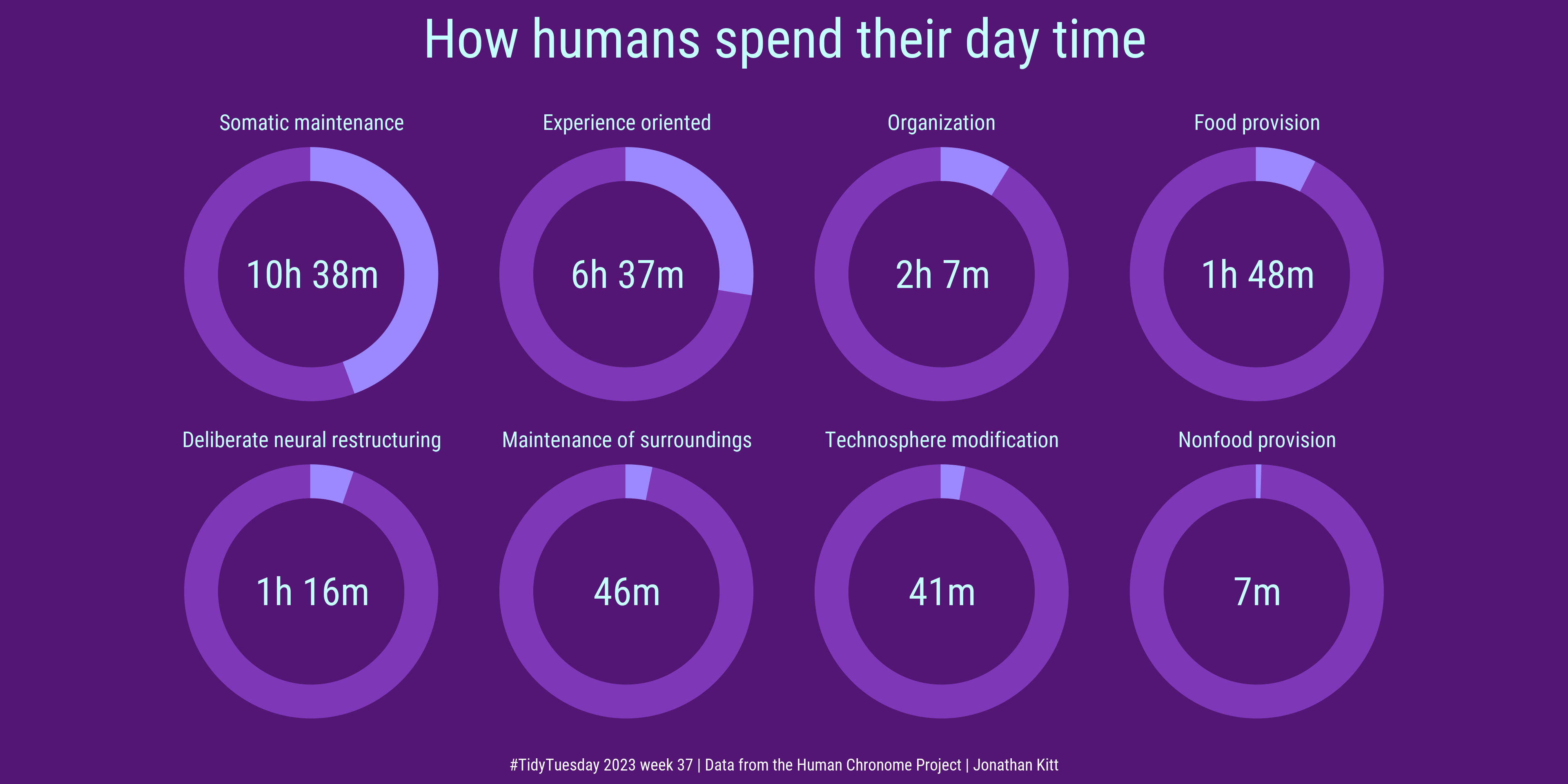
select(Category, total, duration)Creating the plot
First we create a custom function to generate one plot per category :
plot_hm <- function(data, row) {
  ggplot() +
    geom_rect(aes(xmin = 3, xmax = 4,
                  ymin = 0, ymax = 24),
              colour = "#7e38b7", fill = "#7e38b7") +
    geom_rect(data = slice(data, row),
              aes(xmin = 3, xmax = 4,
                  ymin = 0, ymax = total),
              colour = "#9c89ff", fill = "#9c89ff") +
    coord_polar(theta = "y") +
    xlim(c(0.05, 4)) +
    labs(title = d$Category[row]) +
    annotate("text", x = 0.05, y = 0,
             label = d$duration[row],
             family = "Roboto Condensed",
             colour = "#c4feff",
             size = 25) +
    theme_void() +
    theme(panel.background = element_rect(fill = "#541675",
                                          colour = NA),
          plot.background = element_rect(fill = "#541675",
                                         colour = NA),
          plot.title = element_text(family = "Roboto Condensed",
                                    colour = "#c4feff", size = 40,
                                    hjust = 0.5,
                                    margin = margin(b = -10)))
}
We use the following code to create and assemble the plots and export the final figure :
# Create the plots
p1 <- plot_hm(d, 1)
p2 <- plot_hm(d, 2)
p3 <- plot_hm(d, 3)
p4 <- plot_hm(d, 4)
p5 <- plot_hm(d, 5)
p6 <- plot_hm(d, 6)
p7 <- plot_hm(d, 7)
p8 <- plot_hm(d, 8)

# Assemble the plots
p <- (p1 + p2 + p3 + p4 + p5 + p6 + p7 + p8) +
  plot_layout(ncol = 4) +
  plot_annotation(title = "How humans spend their day time",
                  caption = "#TidyTuesday 2023 week 37 | Data from the Human Chronome Project | Jonathan Kitt",
                  theme = theme(panel.background = element_rect(fill = "#541675", colour = NA),
                                plot.background = element_rect(fill = "#541675", colour = NA),
                                plot.title = element_text(family = "Roboto Condensed",
                                                            colour = "#c4feff", size = 100,
                                                            hjust = 0.5, margin = margin(t = 5, b = 25)),
                                plot.caption = element_text(family = "Roboto Condensed",
                                                            colour = "white", size = 30, hjust = 0.5)))

# Export the plot
ggsave("figs/tt_2023_w37_global_human_day.png", p, dpi = 320, width = 12, height = 6)
We now create the second plot:
And here’s the result!